One of the most important aspects of safe driving is avoiding distractions. With most modern cars are now equipped with built-in display, it needs special interface to allow usage with as minimum distractions as possible. Our current popular options are Apple CarPlay and Android Auto. Even if a car does not have built-in display, there are some aftermarket head units that would bring smartphone connectivity to the car dashboard.
As the name suggests, Apple CarPlay is made by Apple starting from 2014. It requires an iPhone to be connected to a car (iPhone 5 or newer, iOS 7.1 or newer) and the interface will give users limited set of smartphone features to be used in a car. There are not many apps available for in-car use. The default set is Phone, Music (and Now Playing icon), Maps, Messages, Podcasts, Audiobook and some audio-focused apps such as Spotify or Audible.
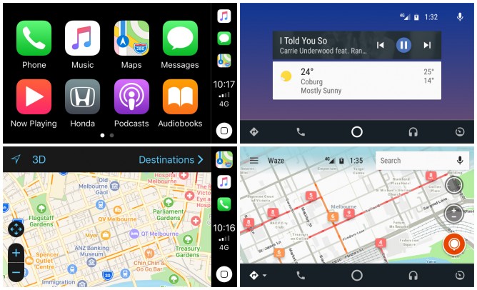
The home screen is a simple interface of 4×2 array of large icons, very easy to use. If we have more CarPlay-compatible apps in our iPhone, the additional apps will appear at the next pages of the home screen, accessible by swiping gesture. When we’re inside an app, quick access icons to Maps, Music and Phone are shown on the right edge of the screen, along with time display, network signal strength indicator and Siri button.
Phone and Messages apps are designed to be mainly operated by voice. We can still do some limited interactions with it, even though it is strongly not recommended when driving. If the car’s steering wheel has built-in buttons, some basic functions can be accessed without looking at the screen at all (changing audio volume or accepting phone calls). Answering phone call is easy. Making a phone call is doable, as long as we manage to make Siri correctly understand the name we speak. Most of the time, she’s a bit clumsy, and slow. Using Messages app is… well, I don’t use it. If something is urgent enough that it can’t wait, a phone call would be made. If it’s only in text message, then it can wait.
Music app allows us to choose our music and choose shuffle or repeat mode. Choosing any music playlist can be achieved within a few taps. I personally feel that listening to Podcasts and Audiobooks can be quite distracting when driving, so I don’t use them at all.
Maps app looks elegant. Getting the map to tell us our location is simple. Location search is doable, again with the limitation of Siri. Most important feature one would expect from Maps app is in-car navigation, and it does offer such feature. We tell Siri where we want to go, and CarPlay will guide us to the destination. At least that’s the theory. In reality, its route suggestion could be so dumb I decided that I couldn’t trust it at all. Some places are not searchable and in times it would guide me to make illegal turns.
Android Auto is Google’s version of in-car display. It makes different design choices compared to Apple CarPlay. For starter, the home screen shows us prominent widgets instead of icons. Default widget is weather (it will automatically detect our location and show local weather). When we use Maps to a destination, or play music, they will appear as widget items. At the top right we can see signal strength and battery indicator, along with digital clock and voice command button. At the bottom bar, we get 5 icons/menus: maps, phone, back home, music and others.
Google takes different approach in doing in-car system. Instead of listing apps by icon, it categorises apps into one of those 5 menus. For example, if I have 3 music player apps in my phone, they are all accessible from Music menu. We can do quick tap to open the last opened music menu, or we can do long press to choose the other music app. I tried several Auto-compatible music apps and they essentially looks the similar in the car display. The music menu would be slightly different and the main interface might offer one or two different buttons but that’s all about it.
Phone menu is also quite straightforward, yet it suffers from one of my annoyances in using Android device: the contacts sync. Since I use Gmail as my main email account, I always so many people I only contacted once or twice crowding my contact list. Cleaning them up is a painful work. In a car, most of us would probably only call less than 5 people frequently.
Maps menu is the best part of Android Auto. It allows us to choose Google Maps or Waze. Both are very capable navigation apps with reliable route suggestion. As a bonus, if your car has digital screen in speedometer area, or perhaps HUD, there is a good chance that the instruction from Google Maps or Waze will be projected in those secondary displays. Mine does, and it’s really convenient. Too bad Google still has not allowed third party navigations apps in Android Auto. Having Sygic in my car system would be awesome.
Overall both systems interface are and simple. If the evaluation is only based on general look and feel, Apple CarPlay would be my clear winner. However, only because Android Auto offers Google Maps and Waze, I end up using Android Auto as my everyday choice. Even it doesn’t look as good, I can still listen to music and receive phone calls in Android Auto. On the other hand, having to use the horrible Apple Maps as the only choice for navigation is just not acceptable.
Leave A Comment